I led the responsive retrofitting of ubuntu.com, the largest site that the Canonical web team is responsible for designing and developing.
Ubuntu.com is visited by millions of people every month. The website wasn’t originally designed to be responsive and the web team at Canonical knew it was important to make it easy to access from any device or screen size. The project had the constraints that come with working on legacy code, with limited available time and resources.
As a first step, I planned the work, dividing it into several stages and smaller projects, tightening and simplifying the scope. This way, the work felt more attainable and the team had regular positive reinforcement through the months when the project ran.
Quick prototype
Before delving into in depth planning, we created a quick prototype which used the existing CSS but in a mobile-first format. The desktop view of the site followed the existing design, and design rules were defined for smaller screen sizes.
Planning
With a quick prototype at hand, it was easier to identify pain points, set realistic goals and expectations, and establish priorities for the project. We deconstructed the project into smaller chunks that were easier to prioritise, dividing the work into different phases in time and identifying the high priority tasks.
Smaller projects first
The retrofit of ubuntu.com wasn’t the only project that the web team was working on at this time. Smaller projects were a good testing ground for ideas we had never implemented — it’s easier to test assumptions and new strategies at a smaller scale before they are live on our largest site.
Some of the key findings from these projects were:
- Improving readability of text for smaller screens couldn’t be achieved by automatically created typographic scales — there was always a certain degree of manual tweaks which involved a lot of real device testing
- Having a solid grid onto which we can confidently place the elements on each screen helped immensely when it came to the speed of development and readability of the content
- The importance of conveying the design intent to developers clearly, across different breakpoints
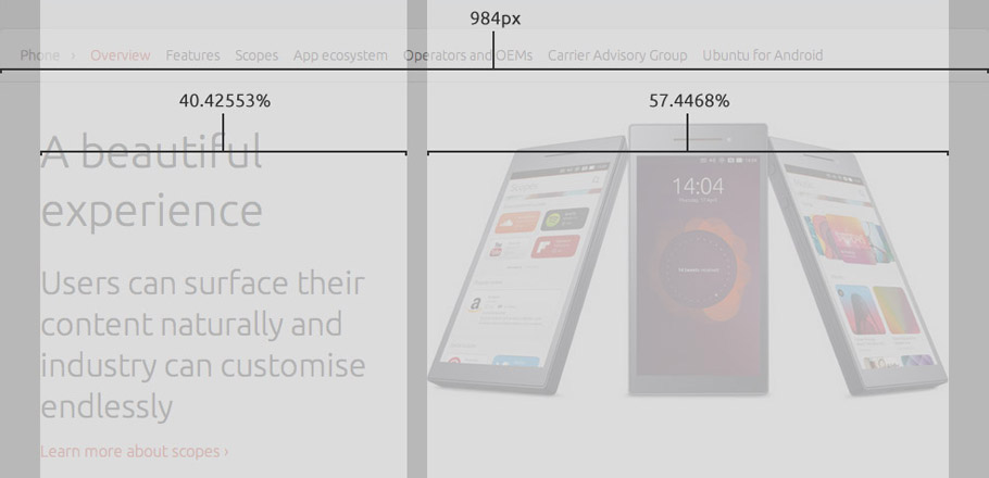
Design
The grid of ubuntu.com was converted to use percentages instead of absolute units ahead of the start of the responsive retrofit, which made it easier to recreate our styles to being fluid.
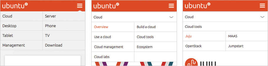
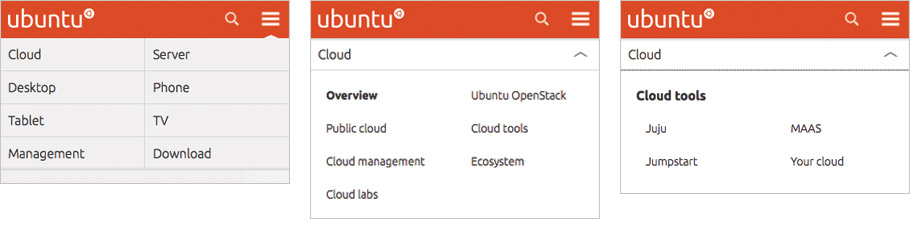
Because of the time and resource constraints, I gathered two visual designers and two UX designers in a room for a couple of hours to brainstorm possible solutions for the site’s navigation. Following existing common design patterns for small screen navigation, we did some paper sketches and a prototype was built following this session so that we could continue to iterate our ideas directly in code.